
Project Objective
Redesign current mobile app Heart Beat Rate Monitor for both Android and iOS consumers. Building upon the foundation of the initial offerings and expanding the feature set while improving upon the user experience and delivering a new user interface to maximize consumer engagement.
iOS


Android


User Research
The app was in desperate need of a redesign. The core functionality was there however because it lacked a good user interface and more robust offerings. The app fell short on the Apple Store and had poor ratings. iOS was an easy transition in my mind because I have worked primarily on iPhone apps, however I saw this an opportunity to flex my android muscle.
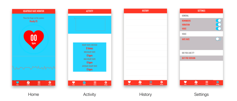
These are my initial observations on the app:
- Colors of app need refinement.
- Hardline monitor is too raw and unappealing.
- Lack of information on what data means.
- Graphics look dated and cheap.
- Font seems sterile and unwelcoming.
- No context of BPM without profiling.
- No use for records besides personal.
- No initial setup to personalize.
- Directions are slightly vague.
- Scanning takes too long.
- Surface level comparative data.
- Flashlight turning on open is an annoyance.
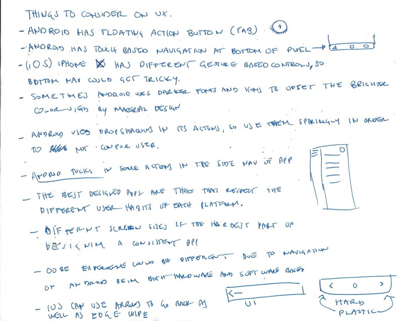
Sketches and rough wireframes made up the bulk of my initial research, trying to understand Android fundamentals so that I could design accordingly.
User Experience
Services
Consumer Research
Design Research
Prototyping
User Experience
User Interface
Prototyping
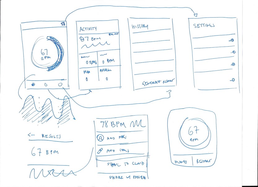
Taking into consideration what I drew up in my preliminary sketches and notes, I created a rough prototype of what the user flow could be.
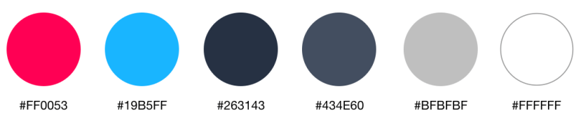
Playing With Dark Colors
The original colors for the app were predominately blue and red. I wanted to echo some of that, however use it sparingly in the new redesign by making them focal points rather than full scale backgrounds. I also added a mix of darker hues and grays to offset the brightness. This refined color palette worked very well in the final product and created a sense of hierarchy that sets the app apart.
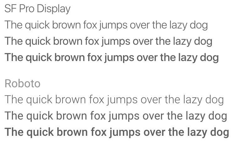
Typography
The original font was blocky and unappealing and had poor synergy with the iconography. The answer was using the standard fonts for both operating systems.
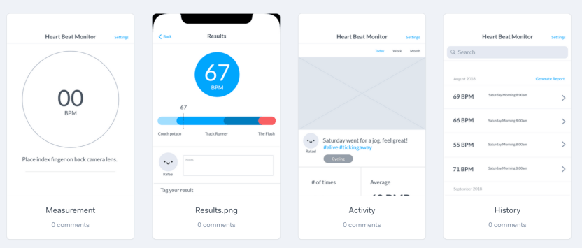
User Interface
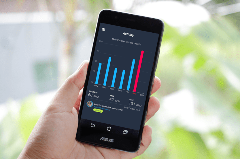
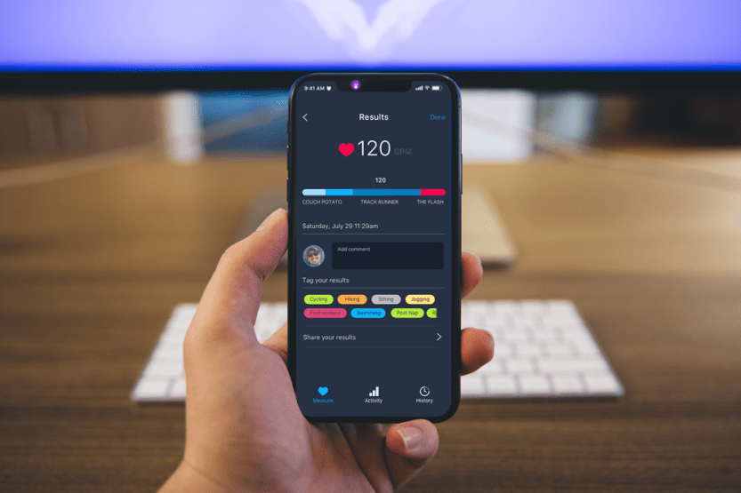
- Upgraded heart beat monitoring dashboard.
- Activity page with weekly breakdown of results.
- Full resolution versions of past history.
- Tracking and commenting on results.
- Activity tagging for future data breakdown.
- Third party app support.
The App on Android
The Android and the iOS version differ slightly based on the consumer. Bottom navigation tabs such as those seen on iOS version are not a common pattern. I replaced the navigation with a hamburger menu to keep the app looking sleek and also to avoid any miss-press due to some Android devices having he native navigation on the bottom.
The App on iPhone
The iOS version of the app took advantage of the sleek elongated design of the iPhone X and natively enhanced the look of the every page.
The Results
The Heart Monitor app was a personal project to redesign an app that was clearly troubled by a bad combination of aesthetics and user experience. After prototyping the product it has seen a substantial increase in user satisfaction and a strong aspect of gamification that was integrated with the system.
Categories: Uncategorized
