
Project Objective
Improve the dated user experience and visuals of an app I had developed a few years back, without losing basic functionality in the app, old app below:


User Experience
The app is simply a monitor for brewing different types of tea using a custom database to add content, reviews, etc. Starting with the basics, this app was originally created with an iOS developer and friend a few years back. The app needed a refresh for a new audience and I was itching to get improve upon its foundation. I looked over the app and stared making preliminary notes on what worked, what didn’t, and what didn’t look that good.


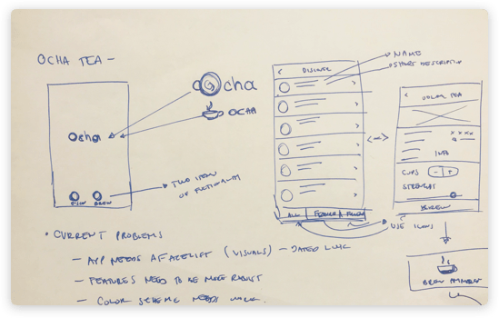
Starting off the navigation was dated and although it is industry standard in many apps, in order to differentiate from the competition we needed an edge in visuals.

The iconography was bulky and intrusive and didn’t seem to harmonize with the rest of the app.
![]()
The colors where muddy and dated, the palette did not age well at all.
The images were not crisp and beautiful which resulted in some teas not looking especially eye catching.
The app had a few bulky features like the ability to create a haiku as you waited for your tea to brew, which is still fun and I plan to integrate in a nicer way.
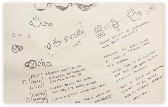
The logo was overly designed and needed a fresh natural look to support the current health trends of today.
User Interface Design
Here I thought about keeping it constricted to what we already had including adding features that would maybe be built in the future, however this was a rudimentary exploration of what it could be.
Card Layouts
A more refined look that took inspiration from the popular card design layout that has been permeating mobile after Google dropped Material design.
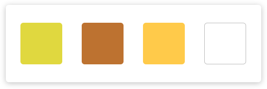
Colors
Dark blue tones and white made the app still have an earthy feel to it, however a more refined earthy feel!
Fonts
The font was also updated with Apple’s current San Francisco font, its a lot more versatile than what I initially designed with and I think the roundness and easiness to read
makes it a true humanistic font.
The font for the logotype was also selected for being a natural looking font that seemed to echo the light and minimalistic look that I was going for. Also, it helped that it works beautifully with the new icon.
Icons
Iconography was limited on the app already but I made it ultra minimalistic by adding a small leaf icon at the bottom of the app to ground the design, also sending you to the home page as a redundancy for the navigation.
The Results
So this is the results after some hard work and a few cups of tea. I created an app that was far more effective in proving a great user experience, while giving the app a much needed facelift.


The Splash Screen
Carries the colors of the app and gives you the OCHA logo before it fades into the Discovery page. Simple.
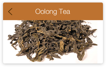
The Discover Screen
Replaces the need to have a splash login page, instead users are launched directly into the search list and are able to browse through cards with imagery and some flavor text. Each card is categorized as a black tea, green, white, etc…
The Detail Screen
Uses the image as selected as the backdrop creating a sense of cadence in the flow, in the example you can see that now only black tea varieties are present, already one level deep but since the UI is familiar then it seems as though nothing has changed too drastically.
The Brew Screen
Has a distinctive quality in that it is the most stunning page in the app giving you a fresh portrait view that has a minimalistic approach to the measurement aspect of the app, once the number of cups and strength of tea has been decided then the user simply selects brew and they are given a simple animation and countdown timer that can be viewed on the phone and on the smartwatch.
Categories: Uncategorized
